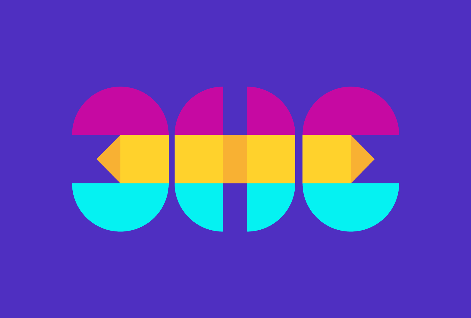
Company: 3HE
What they do: A media business educating women in Web 3 (blockchain, meta, crypto etc).
Brief: The target audience is women who don't know anything about Web3 or are curious. We needed to strike the balance of being innovative but not too extreme that it intimidates people.
Design Choices: I decided upon the most simple shapes to make up this logo, to reflect making web 3 simple and easy to understand. I’ve only used squares, triangles and circles, this is also used with the social media templates. I put these shapes together in a way that the logo is completely symmetrical.
MHC Digital is a financial management company entering the world of Web 3. The owner of the company comes from a traditional banking background with a lot of experience in that area. The objective for the logo was to try and balance web 3 and traditional finance. Simplicity was a must, I came up with the halo, split into 3 gradients, these gradients represent the 3 pillars of the company: Funds Management, Crypto trading, and Corporate Finance. The colour of the logo and the use of gradients is a nod to the world of Web 3.
Company: Louis n’ Anna
What they do: Cajun Seafood & BBQ Restaurant
Brief: Steak house/ Cajun restaurant vibe
Design Choices: I came up with the concept of Combining the Fleur-de-lis (the symbol of Louisiana) and a Crawfish together.
Links: N/A
Designs and finished products for the official plush toy range for DC comics in Australia. Also included is the original concept art that was proposed to DC which helped secured the license.
Company: Bark Construction
What they do: Construction, carpentry
Brief: Complete creative freedom
Design Choices:
I’m good friends with the client and his dog is always on-site, incorporating that and the timber was a no-brainer. Most of his business growth is from word of mouth and public visibility so I wanted strong branding that we could print on merchandise and get our friends to wear. I pulled a lot of inspiration from early Mambo designs.
Links: https://www.instagram.com/bark.construction/
Company: H&G Tiling
What they do: Tiling
Brief: Originally the client just wanted a word mark. I convinced them to add an icon to help with the branding and open up more creative possibilities
Design Choices: Custom modern lettering to stick to the brief and a simple symmetrical icon drawing inspiration from tile designs.
Links: https://www.instagram.com/h_and_gtiling/
Social media templates and brand guidelines for Ninety3 Marketing
Official Doona Cover, Printed Polar Fleece, premierships towel, player doona cover and towel designs for the AFL.
Official merchandise designs and finished products for the 2018 Commonwealth Games on the Gold Coast.
Various designs done for Fight Legends video game: pitch deck, Youtube tiles/ schedules, character reveals, partnerships, roadmaps, stage reveals, web assets, Website wireframes, game mechanics, video overlays, NFT reveals, competitions and photo editing.
Pitch Deck and Website wireframes for Liquid Crypto.
Company: Estate Media
What they do: Property photography for construction and Real Estate
Brief: The client wanted the logo in black and white, besides that, I had creative freedom
Design Choices: I incorporated a camera lens with shutters, and the shape of a house coming through the lens.
Links: N/A
Doona cover design and finished product for the Wiggles.
Packaging Designs and finished product for Wiggles plush toy range.
Official towel and printed polar fleece designs for the NRL.
Company: Oz Gamer92
What they do: Twitch Streaming
Brief: An illustration/ Logo that combined anything “nerd culture” and Australia
Design Choices: Dragon ball Z and a kangaroo, does any more need to be said?
Brand development for a local electrician. The brief was fairly open so I decided to incorporate Dan’s initials into the logo, using the “D” as a power socket and the “m” as an electrical cord.
https://www.instagram.com/dmelectrical_/?hl=en
The client gave me a fairly simple brief to convert his tattoo into the logo for his stonemason company. to get the scale and positioning on the logo right was a challenge, but both the client and myself were extremely satisfied with the finished product. I also designed his business cards and apparel.
Tom approached me to create his company profile with a completely open brief. i decided to incorporate a spiral staircase as the logo looking like the letter “S”. Both myself and the client were really happy and the business cards have come out great as well.
Company: Absolute Payroll
What they do: Payrolls
Brief: The client is a massive comic book fan, he wanted a logo that made payroll a bit more fun.
Design Choices: Comic book font and textures, bright colours to give of a playful vibe
Links: https://www.linkedin.com/company/absolute-payroll/
Logo design for a film and production company called "no qualms". A lot of creative freedom but he wanted the logo to be bold and simple, I decided to incorporate the film role for the letter "Q" which the client was very happy with. I also designed a couple of shirt design, the brief was to make a series of "no" illustrations featuring stick figures.
Company: Pez’s Auto Electrical
What they do: Auto Electrical engineering
Brief: Perry only wanted 1 thing, and that was his dog in the logo and the colour green
Links: https://www.instagram.com/pezs_autoelectrics/?hl=en
Nick approached me with an open brief and I had a lot of different ideas trying to incorporate “glass” and “smart”. With some strong elements i though this would be fairly straight forward, but it ended up being one of my toughest logo designs. I eventually ditched trying to use glass in the logo as i couldn’t get it to work no matter how i put it together and decided that we were better off using a simpler, bolder logo. Both myself and the client were extremely happy with the result.
Brand Development and website for Oakwood Projects
https://www.oakwoodprojects.com.au/
The brief was very open, the name wasn't decided and the only thing the client specified was the colour green, This is what i came up with and the client could not have been happier. I designed the logo business cards, records board, timetable and social media elements.
Logo design and business card design for Logicool air, a Sydney based air conditioning company. The client wanted to incorporate a sun/snowflake in the logo with a sleek metallic font.
Logo design for a Pilates studio based in Dee Why NSW. I also designed the brochure and business cards.
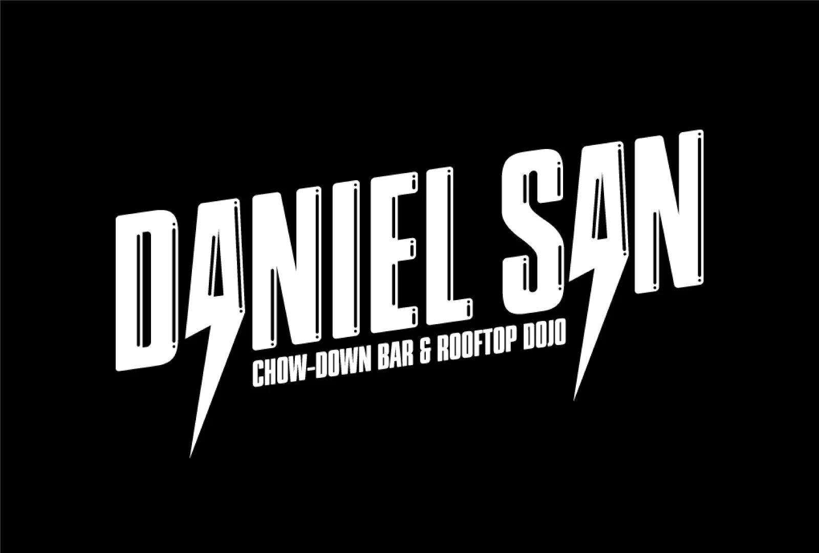
Brief was to design a bold black and white logo incorporating a lighting bold somewhere in the design. I designed the logo, business cards social media elements and car decals.
Counter display unit packaging design and swing tags for Animal Planet.
Packaging design and finished product for a counter display unit.
CDU and sell sheet designs for Shopkins
Event Booklet and invitations for the 2020 IMM international event.
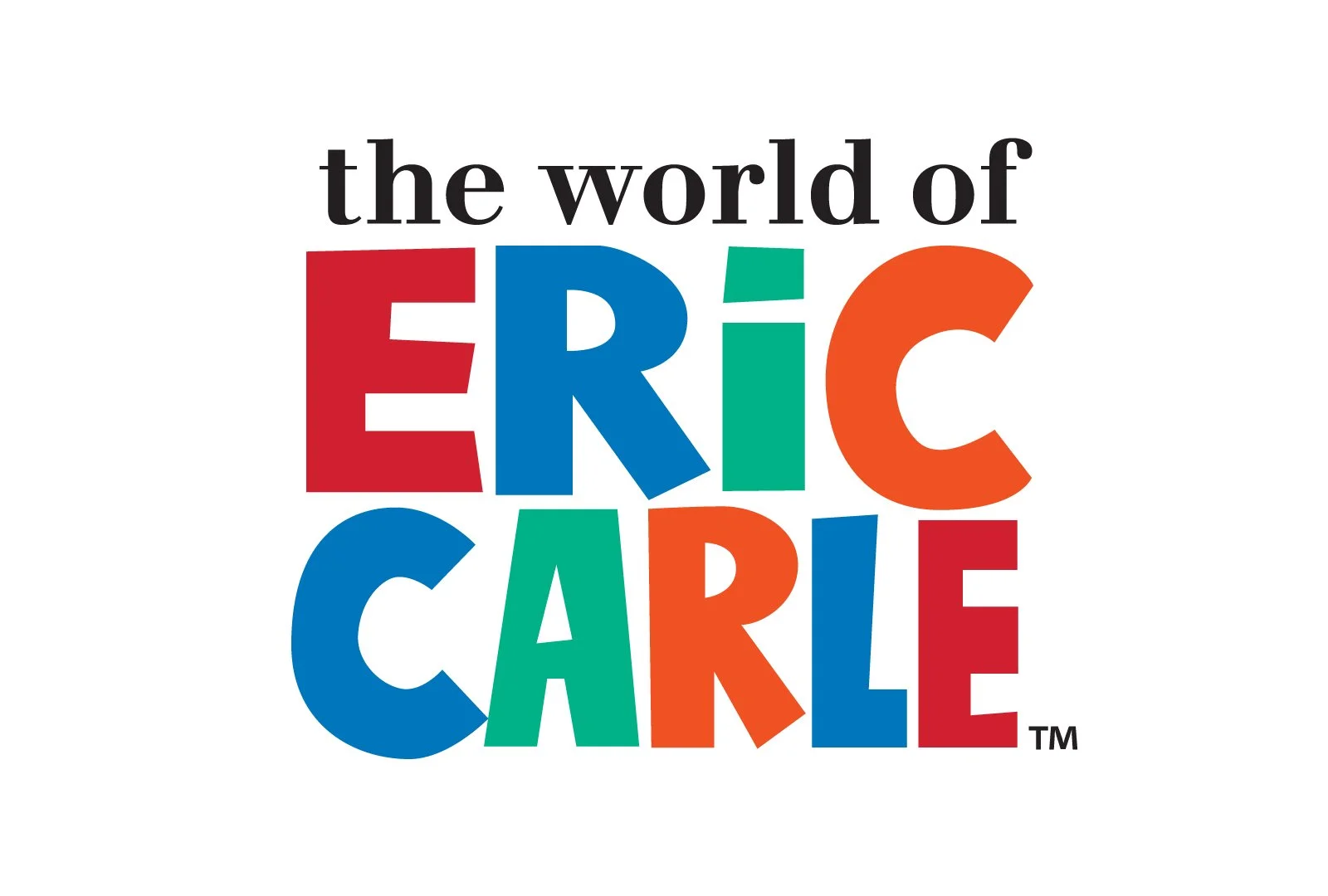
Official Children’s Story book and packaging design for Eric Carle
Logo and illustrations for Monsters of Dance studio.